|
|
Post by superteacher on Aug 1, 2021 15:10:41 GMT
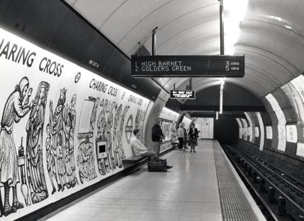
How many stations still have these? I was wondering as I was at Moorgate the other day and saw them there.
|
|
Tom
Administrator
Signalfel?
Posts: 4,199 
|
Post by Tom on Aug 1, 2021 18:02:09 GMT
I think there are a fair few on the Northern line, but exactly where I'm not sure as I've not worked much on the line. There was some discussion in LU in the last year about having to modify them for the Northern line extension, and many of them hadn't been modified since the 1980s.
|
|
North End
Beneath Newington Causeway
Posts: 1,769
|
Post by North End on Aug 1, 2021 18:11:59 GMT
I think there are a fair few on the Northern line, but exactly where I'm not sure as I've not worked much on the line. There was some discussion in LU in the last year about having to modify them for the Northern line extension, and many of them hadn't been modified since the 1980s. There are a few, but it isn’t many. Mainly the ex Metronet stations which weren’t on their refurb list. The following is from memory, but is roughly along the right lines: Embankment Charing Cross London Bridge Moorgate There may be one or two others but that’s about it now. At least one of these I think retains the original upper-case typeset, but I can’t remember which one(s) off the top of my head. Tube lines did quite a cull of them in the 2000s, even at stations they didn’t refurb. |
|
|
|
Post by AndrewPSSP on Aug 1, 2021 19:34:40 GMT
I think a lot of the Bakerloo still has them too  I presume you are referring to this style? I like the some of the ones on the Northern in the Small Caps typeset |
|
Tom
Administrator
Signalfel?
Posts: 4,199 
|
Post by Tom on Aug 1, 2021 19:42:58 GMT
There were several variants of sign. GEC provided many of them but Thorn were the other supplier. The one above was, from memory, a Thorn. The Northern line had an older design on Thorn sign which was more like this:  (photo from LT Museum) |
|
North End
Beneath Newington Causeway
Posts: 1,769
|
Post by North End on Aug 1, 2021 20:50:06 GMT
There were several variants of sign. GEC provided many of them but Thorn were the other supplier. The one above was, from memory, a Thorn. The Northern line had an older design on Thorn sign which was more like this:  (photo from LT Museum) Very nice. That design had an air of officialdom and presence about it which most of the later designs lacked. Having said that, I always quite liked the 1990s Central Line design - much better than some of what has come since, especially the way general messages are in a different colour and on a dedicated line. On a related note, the Central Line indicators occasionally used to display a Merry Christmas graphic and message in multiple colours, taking up the entire displays. Did anyone ever get a photo of this? In the 2000s there was still an option to set this up on the station terminal, but I could never get it to work. |
|
Tom
Administrator
Signalfel?
Posts: 4,199 
|
Post by Tom on Aug 1, 2021 21:35:36 GMT
I personally preferred the older displays too - they were much more visible from a distance than the current ones which LU seems to have bought from the same supplier as Network Rail.
I found the Poltech ones DLR uses are pretty good too, though I understand Poltech have subsequently ceased trading.
|
|
North End
Beneath Newington Causeway
Posts: 1,769
|
Post by North End on Aug 1, 2021 23:59:02 GMT
I personally preferred the older displays too - they were much more visible from a distance than the current ones which LU seems to have bought from the same supplier as Network Rail. I found the Poltech ones DLR uses are pretty good too, though I understand Poltech have subsequently ceased trading. I have an idea they now go for more smaller indicators as this is supposed to encourage people to spread along the platform. I’m not sure this necessarily works in practice. Some of the newer indicators on the Vic Line are awful IMO. The various ones installed by Metronet look cheap, the design mainly used by Tube Lines isn’t so bad. |
|
|
|
Post by grumpycat on Aug 2, 2021 2:20:47 GMT
Wasn't the one at London Bridge almost replaced though?
|
|
|
|
Post by Chris L on Aug 2, 2021 3:24:45 GMT
I personally preferred the older displays too - they were much more visible from a distance than the current ones which LU seems to have bought from the same supplier as Network Rail. I found the Poltech ones DLR uses are pretty good too, though I understand Poltech have subsequently ceased trading. I have an idea they now go for more smaller indicators as this is supposed to encourage people to spread along the platform. I’m not sure this necessarily works in practice. Some of the newer indicators on the Vic Line are awful IMO. The various ones installed by Metronet look cheap, the design mainly used by Tube Lines isn’t so bad. There are minimum letter heights for such signs on railways. People need to be able to read the information as they enter the platform. I don't believe the latest signs meet the standards. |
|
|
|
Post by spsmiler on Aug 2, 2021 8:57:29 GMT
I thought that these were the best ones, because they had large text that could be read from a distance and could show different colours. Everything else from then has been downhill / retrograde 'improvement', even money wasted (to my eyes)!  |
|
North End
Beneath Newington Causeway
Posts: 1,769
|
Post by North End on Aug 2, 2021 23:16:00 GMT
I thought that these were the best ones, because they had large text that could be read from a distance and could show different colours. Everything else from then has been downhill / retrograde 'improvement', even money wasted (to my eyes)!  I’ve always had a soft spot for the Central Line ones. They’re very fit for purpose. To update my recent post regarding the original ones surviving on the Northern - as luck would have it I had business on the Charing Cross branch today. It is just Charing Cross and Embankment which remain. None of these use the original typeset, three of them are lower case, and one of them is upper case but the condensed small version. It therefore must by Moorgate and/or London Bridge which are still as per original. I’ll have a look next time I’m round that way, if no one else beats me to it. Incidentally, I was struck by how Embankment station still retains a very 1990s LU feel, complete of course with the Peter Lodge “Mind the Gap” announcement. |
|
|
|
Post by capitalomnibus on Aug 2, 2021 23:59:36 GMT
I think a lot of the Bakerloo still has them too  I presume you are referring to this style? I like the some of the ones on the Northern in the Small Caps typeset Was that not the second style of digital platform signs on LUL |
|
|
|
Post by capitalomnibus on Aug 3, 2021 0:01:06 GMT
I thought that these were the best ones, because they had large text that could be read from a distance and could show different colours. Everything else from then has been downhill / retrograde 'improvement', even money wasted (to my eyes)!  That is the third type. I remember when these were put in not long after the new 92 stock Central line trains. I think it may have been around 1996 IIRC |
|
class411
Operations: Normal
Posts: 2,747 
|
Post by class411 on Aug 3, 2021 7:48:32 GMT
I thought that these were the best ones, because they had large text that could be read from a distance and could show different colours. Everything else from then has been downhill / retrograde 'improvement', even money wasted (to my eyes)!  Interesting to note that although the alpha has proportional spacing (although they seem to have got the 'k' metrics wrong), the numeric does not leading to that large gap between the '1' and '2'. |
|
|
|
Post by brigham on Aug 3, 2021 8:00:40 GMT
'Kerning', as it's called in the Trade.
|
|
|
|
Post by t697 on Aug 3, 2021 8:10:46 GMT
I also thought the Central line project DMIs were nice. The style must have fallen out of favour quite quite quickly though. When we suggested that font for the D78 Refurb, we got very much a flamethrower rejection from LU!
|
|
|
|
Post by MoreToJack on Aug 3, 2021 8:27:41 GMT
'Kerning', as it's called in the Trade. Always preferable to keming. |
|
class411
Operations: Normal
Posts: 2,747 
|
Post by class411 on Aug 3, 2021 9:34:51 GMT
'Kerning', as it's called in the Trade. Kerning and proportional spacing are not the same thing. With proportional spacing, characters take up varying amounts of space according to their width. Kerning is altering that spacing to do things such as make hyphens or underscores form solid lines, of account for character pairings that would tend to appear to leave excessive gaps. |
|
|
|
Post by Alight on Aug 3, 2021 18:13:17 GMT
Was that not the second style of digital platform signs on LUL Indeed, that picture is the second style manufactured by Thorn, which in my view look a lot more streamlined than the original Northern line style - I say original, technically there was a style before that, which were the ones trialled at St. James's Park in 1981. The example photographed above as seen on the Bakerloo line doesn't have the 'futuristic' feel of other examples such as the one shown on page 3 of this edition of Undergound News, which has that flexible trunking at one end and then uses clear suspenders on the other end for that bit more finesse. Incidentally, these displays would have had the aeroplane symbol for Heathrow, prior to having to differentiate between T4 and T5. I also thought the Central line project DMIs were nice. The style must have fallen out of favour quite quite quickly though. When we suggested that font for the D78 Refurb, we got very much a flamethrower rejection from LU! Agree with the sentiment many of you have said about the Central line DMIs, particularly the contrasting green text. My only criticism would be the capitalisation of 'Mins' as it does look a bit ugly. Then again, I have an issue with 'mins' across the board on LU/DLR as it should really be 'min', which thankfully LO and buses adopt. The Central line variant is the ones with the "here" and "held" indications, correct? Or are they the Metronet type I am thinking of? |
|
|
|
Post by superteacher on Aug 5, 2021 16:56:43 GMT
Thread moved to "stations" as it's no longer just related to the Northern line. So feel free to have a general chat about the first generation DMI's.
|
|


