|
|
Post by amershamsi on Aug 31, 2006 23:09:09 GMT
It is a nice idea but as the 7 car trains will be interchangeable this would pose a few problems operationally. Also, I would imagine that this type of system would be a maintenance liability. There is also an issue of cost too. Ignoring cost and maintainance, surely it would be simple - have LEDs in all the colours (2, surely for 7-car? - green and yellow/pink) and have them on different circuits, or have 2 way LEDs (can get green/red, not hard to do them in different colours (well no harder than getting individual ones, unless using white+filter) and have a switch in the drivers cab with three settings - one for each colour and off. Operationally fairly simple, though the other things suggest it may be a bit difficult to do. having the hand rails change colour would be awesome, though completely pointless! |
|
prjb
Advisor
LU move customers from A to B, they used to do it via 'C'.
Posts: 1,840
|
Post by prjb on Aug 31, 2006 23:18:36 GMT
have a switch in the drivers cab with three settings - one for each colour and off. Operationally fairly simple, though the other things suggest it may be a bit difficult to do Operationally this would cause problems, drivers are busy Bee's and we are trying hard to cut down on the amount of tasks they have to perform. I would not want to add a superfluous one such as this to their list. It is a nice idea though. Theoretically we could automatically link up the LED's to the destination codes but ultimately, cost and maintenance kill this one.  |
|
Deleted
Deleted Member
Posts: 0
|
Post by Deleted on Sept 1, 2006 7:52:15 GMT
are you talking about a line of them like christmas lights?
|
|
Deleted
Deleted Member
Posts: 0
|
Post by Deleted on Sept 1, 2006 8:57:41 GMT
I can see how cost would be an issue with coloured LEDs, nice though they would be.
It would be helpful to have the different lines clearly differentiated in some way. Can't we have a 2 line display on the front, e.g. Tower Hill / District Line?
|
|
|
|
Post by CSLR on Sept 1, 2006 9:37:36 GMT
I can see how cost would be an issue with coloured LEDs, nice though they would be. It would be helpful to have the different lines clearly differentiated in some way. Can't we have a 2 line display on the front, e.g. Tower Hill / District Line? Although I realise that this is not going to happen, I think that I am losing the plot here. Are we talking about colour coding for destinations to make it easier for partially-sighted/illiterate individuals to know where the train is going or where they are? If so, this is similar to the coloured light destination bulbs that were displayed on the front of early LCC trams. It is also reminiscent of the tiling schemes used at Yerkes tube stations, where the colour and pattern helped to indicate the location to those who could not read or who could not see a station sign. The other alternative is that this post is suggesting a colour coded display which reflects the key colour of the line (eg. red for Central, green for District, etc). If this is the case, I particularly look forward to seeing Northern line displayed in black lights. |
|
Deleted
Deleted Member
Posts: 0
|
Post by Deleted on Sept 1, 2006 9:51:14 GMT
The other alternative is that this post is suggesting a colour coded display which reflects the key colour of the line (eg. red for Central, green for District, etc). I believe that's the idea. ;D Fortunately the Northern has its own unique stock so that wouldn't be a problem. We're talking about stock used on four different lines. |
|
prjb
Advisor
LU move customers from A to B, they used to do it via 'C'.
Posts: 1,840
|
Post by prjb on Sept 1, 2006 16:56:17 GMT
I can see how cost would be an issue with coloured LEDs, nice though they would be. It would be helpful to have the different lines clearly differentiated in some way. Can't we have a 2 line display on the front, e.g. Tower Hill / District Line? You will be getting a three line display if the current proposal goes ahead. I think the use of different colours might not be appropriate due to issues around the visually impaired. |
|
Deleted
Deleted Member
Posts: 0
|
Post by Deleted on Sept 1, 2006 17:12:13 GMT
You will be getting a three line display if the current proposal goes ahead. Ooh, aren't we lucky! ;D Is that to show "via" information as well? Wouldn't some visually impaired people find colours easier than text? |
|
prjb
Advisor
LU move customers from A to B, they used to do it via 'C'.
Posts: 1,840
|
Post by prjb on Sept 1, 2006 17:28:35 GMT
The current thinking goes: Train Number
Destination
Route info So in reality you would get: 222
Hammersmith
via Shepherds Bush I'm no expert on this, but as I understand it we have to be very careful with the use of colours. Some are easier to see than others. |
|
|
|
Post by qwijib0 on Sept 1, 2006 18:13:14 GMT
 High-Visibility orange for the text, plus color coding for the line. |
|
Deleted
Deleted Member
Posts: 0
|
Post by Deleted on Sept 1, 2006 19:12:44 GMT
High-Visibility orange for the text, plus color coding for the line. I like that. Reminds me of another point - can we please have the destination in CAPITALS? |
|
|
|
Post by Tomcakes on Sept 1, 2006 19:25:58 GMT
Can't the lines be indicated by boards? For example, where the current line sticker is have a little holder and two metal/plastic plates - one with HAMMERSMITH & CITY on one side and CIRCLE on the other, another with DISTRICT and METROPOLITAIN respectively. These could be manipulated so the relevent line face would be at the front of the train, and would only have to be changed rarely. Plus a simple, failure-free and cheap solution?
|
|
Deleted
Deleted Member
Posts: 0
|
Post by Deleted on Sept 1, 2006 19:31:23 GMT
High-Visibility orange for the text, plus color coding for the line. I like that. Reminds me of another point - can we please have the destination in CAPITALS? Indeed, this small insignificant thing is actually really annoying for some reason! |
|
Deleted
Deleted Member
Posts: 0
|
Post by Deleted on Sept 1, 2006 19:33:35 GMT
Can't the lines be indicated by boards? For example, where the current line sticker is have a little holder and two metal/plastic plates - one with HAMMERSMITH & CITY on one side and CIRCLE on the other, another with DISTRICT and METROPOLITAIN respectively. These could be manipulated so the relevent line face would be at the front of the train, and would only have to be changed rarely. Plus a simple, failure-free and cheap solution? That's a return to what we had decades ago! Although that makes it proven technology...  But it would be easier to have it set along with the destination. |
|
Deleted
Deleted Member
Posts: 0
|
Post by Deleted on Sept 1, 2006 20:07:07 GMT
The Disability Discrimination Act has some particular rules in relation to destination display arrangements but as far as I can see they only apply to Buses and Coaches (and only those new to build after the rules came in). However TfL have added their own layer of additional requirements ..and whilst these too apply to buses it may well be that TfL will require they apply to trains as well.
The DDA requires destinations to be in Lower Case except leading capitals. Allegedly because they are easier to see and understand, however characters must be smaller as you have to accommodate "risers" in letters like "b" "d" "h" etc and "descenders" in "y" "q" and "p" However the minimum character height for destinations is 125mm. On a test of two buses at Walthamstow Central Station however everyone asked preferred the all capital letter display !!!
TfL rules additionally require that there be no abbreviations eg "BDY" "ST" "RD" (St may be permitted for "Saint" but not for "Street"). Displays must be Yellow on a black background. reversed displays not allowed (We used to have them for Woodford - Hainault through loop services) also not allowed for "Not In Service". Dot matrix displays are not allowed. These rules are aimed at buses I remind again ! There are other rules but they would have no bearing on trains.
I've never been keen on the set number appearing above the destination ....looks like a route number !
I find that it looks better if the via point does not have the same prominence as the main destination.
Ultimately I don't buy the idea that even the new dot matrix on the D stock looks clearer than a destination blind, I'm also concerned that grime seems to be getting between the display and the front glass. However, the D stock is a vast improvement on the 1973 stock !!!
A large FST (Flat) screen with the info in proper Johnson font would look much nicer though !
|
|
Deleted
Deleted Member
Posts: 0
|
Post by Deleted on Sept 1, 2006 20:10:10 GMT
The pre-publicity drawings of the S stock interior would look so much better if they weren't shown with a replica of that dreadfull dark grey "C" stock refurb moquette. A bright cheery moquette is a must ! If we are using line colours, a green and yellow main base with added pink and maroon design features would be much nicer ;D  |
|
Deleted
Deleted Member
Posts: 0
|
Post by Deleted on Sept 1, 2006 21:40:11 GMT
The pre-publicity drawings of the S stock interior would look so much better if they weren't shown with a replica of that dreadfull dark grey "C" stock refurb moquette. A bright cheery moquette is a must ! If we are using line colours, a green and yellow main base with added pink and maroon design features would be much nicer ;D You mean something like this? 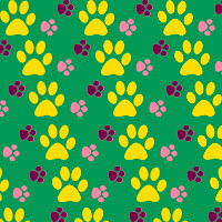 PS: I would like credit if anyone is insane enough to use this |
|
Deleted
Deleted Member
Posts: 0
|
Post by Deleted on Sept 1, 2006 21:49:30 GMT
for the dog rug in the back of the car maybe...
|
|
Chris M
Global Moderator
Forum Quizmaster
Always happy to receive quiz ideas and pictures by email or PM
Posts: 19,404
|
Post by Chris M on Sept 1, 2006 22:45:01 GMT
My very rough first attempt is below. The only program I have to hand to create it in is Paint, so its not very well drawn but you get the idea. Obviously all the stripes (and intervals), circles and diamonds would be the same size. Perhaps someone could redo it in a more apropriate package? 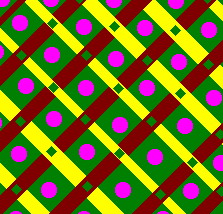 |
|
Deleted
Deleted Member
Posts: 0
|
Post by Deleted on Sept 1, 2006 22:46:27 GMT
but would it be like on the Jubbly where Tube Lines have their own moquette, so metronet will have theirs. (presumably)
|
|
Deleted
Deleted Member
Posts: 0
|
Post by Deleted on Sept 1, 2006 23:02:47 GMT
for the dog rug in the back of the car maybe... Some of the existing moquettes look like they were "designed" under the influence. It had just occurred to me that this design, and I use the term loosely, would encourage customers to place their paws on the seats. ;D I do like Chris M's idea though. It's better than the doggie one, but may still induce migraines in some... |
|
Deleted
Deleted Member
Posts: 0
|
Post by Deleted on Sept 1, 2006 23:08:47 GMT
I do like Chris M's idea though. It's better than the doggie one, but may still induce migraines in some... Is it possible to design a moquette with green, yellow, pink and purple in it that doesn't induce migraine? |
|
Deleted
Deleted Member
Posts: 0
|
Post by Deleted on Sept 1, 2006 23:10:49 GMT
just like the met one now but with different couloured triangles.
|
|
Chris M
Global Moderator
Forum Quizmaster
Always happy to receive quiz ideas and pictures by email or PM
Posts: 19,404
|
Post by Chris M on Sept 2, 2006 1:25:38 GMT
Another idea for a simpler, and possibly less headache-inducing design. Again this is just quickly drawn in paint and so nothing lines up. The paler yellow and pink could be used on the first design as well, and do make it easier on the eye. 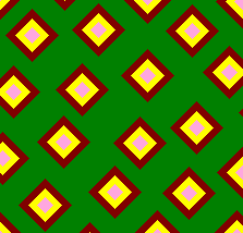 |
|
Colin
Advisor
My preserved fire engine!
Posts: 11,310
|
Post by Colin on Sept 2, 2006 3:07:54 GMT
Folks, whilst i'm sure your artistic talents are appreciated, let's not get too far ahead of ourselves here. The thread seems to be starting to wander off course and into the realms of fantasy - i'm not saying don't post your thought's, questions, etc; just try and keep it relevant. I think this quote from prjb on page 3 of this thread sums up the point i'm trying to make: Just as the design goes through specific stages of evolution so does the consultation process. Whilst I do not claim to be responsible for Comms, I know that everything is in place for the right people to be consulted at the right time. There is no point in speaking to customers about moquette (just as an example) right now, but when the design has reached that point we will have got proper documented feedback. Right now we are seeking input from staff (as well as ongoing talks with relevant external parties) and that is what I am attempting to encourage here. Also, this thread will soon be locked (at suitable time - don't stop posting though!) and a new one started as there is a known Proboards bug which affects threads with 500+ post's in them. |
|
Ben
fotopic... whats that?
Posts: 4,282 
|
Post by Ben on Sept 2, 2006 18:39:44 GMT
Very interesting points there aspect. qwijib0's design has merit, but I too think any text would be far clearer in flourescent yellow on a black background
|
|
Deleted
Deleted Member
Posts: 0
|
Post by Deleted on Sept 2, 2006 18:59:10 GMT
the display is fine but the duty number is surely much more useful where it is now, partly because it has nothing to do with the destination (to the customer). But also aren't there cameras accross the SSR focussed only on that part of the train? that would have to be moved.
The three lines is definintely a very good idea as it gives people even more confidence they have the correct train, but couldn't the top line be bigger but with lower case and the rest in lower case just smaller.
|
|
Deleted
Deleted Member
Posts: 0
|
Post by Deleted on Sept 2, 2006 19:16:30 GMT
But also aren't there cameras accross the SSR focussed only on that part of the train? that would have to be moved. The A stock numbers are in a different place from C and D stocks, so some adjustment would be necessary wherever you put them. |
|
Deleted
Deleted Member
Posts: 0
|
Post by Deleted on Sept 2, 2006 19:18:10 GMT
still, though, putting the number up there would not be of any use to the customer, so they could have a little rear route number display like on the back of buses.
|
|
Colin
Advisor
My preserved fire engine!
Posts: 11,310
|
Post by Colin on Sept 2, 2006 19:47:24 GMT
The main use of CCTV when being used to view the front of trains is indeed to check it's set number matches the signalling system's information - but it can prove useful to see what destination is set without having to look it up in the working timetable (providing the driver has got it right ;D). So having both in the same area is sensible and allows the camera to be zoomed in for a clearer image.
The secondary purpose of CCTV viewing the front of trains is for service information or duty managers when re-forming the service. Again it's useful to get all the neccesary information with one glance rather than having to look up the details.
The Piccadilly line has it's set number just above the destination and i've yet to see anyone get confused by it, so I don't envisage any problems with this set up.
|
|